Project Background
Designed in 2008, Stack Overflow is the most visited and trusted source for code related questions and answers.
Until 2019, with its new design system launched, the site never fully had a redesign, and was only slowly updating its design when judged necessary, leaving users feeling excluded from the design process.
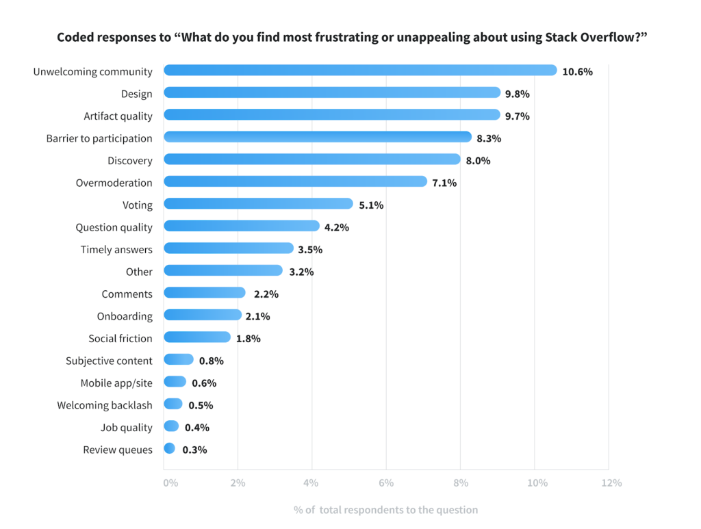
Since then, users had been expressing dissatisfaction through surveys and on-site (meta) feedback. They found it difficult to use, outdated, and unattractive. More recently, the topic of “design” consistently ranked among the top three pain points highlighted by users.
My role was to lead this project by defining a strategy, kick-starting research and propose a new design.
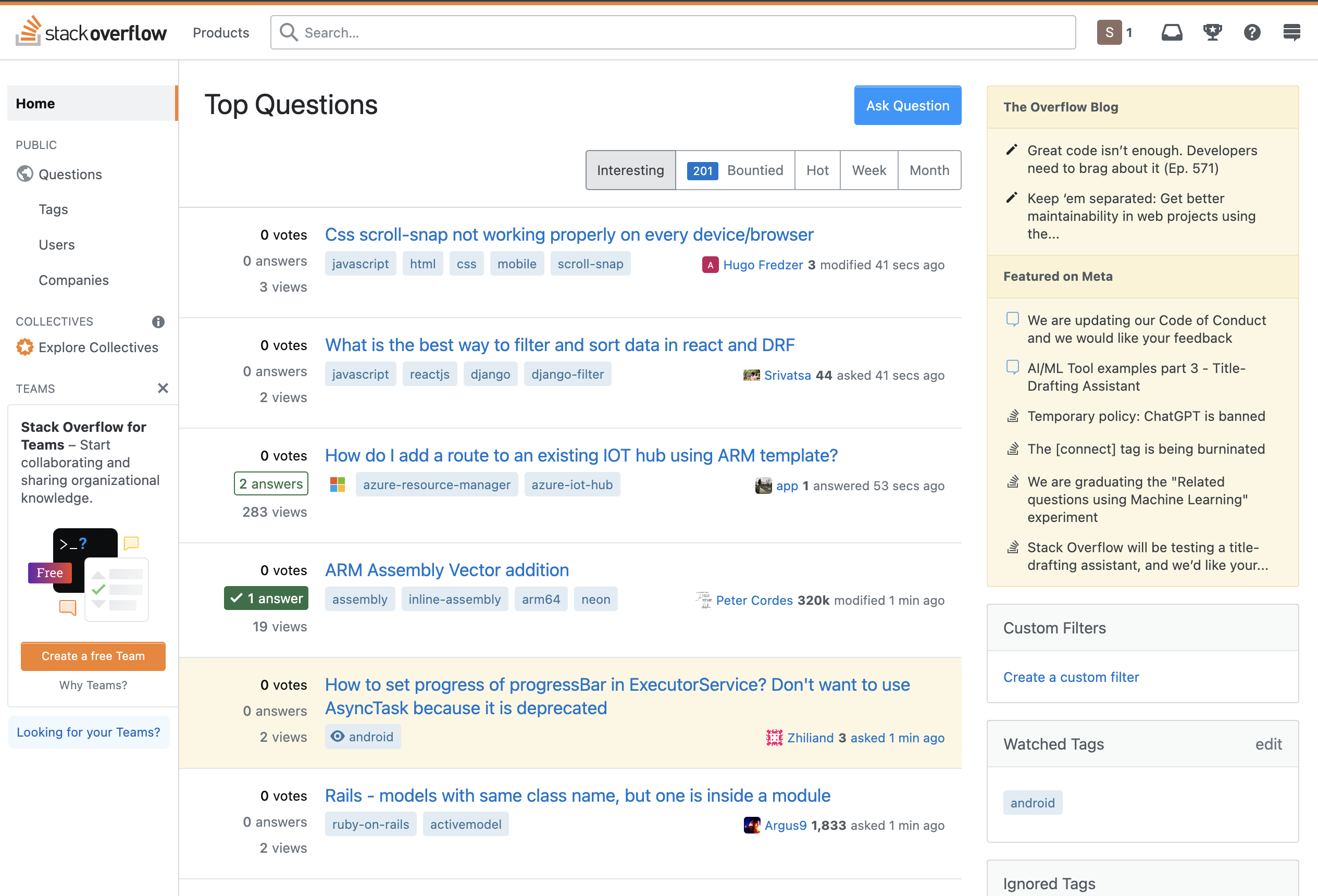
“It’s really disappointing how consistently any UI changes to the site actually make the experience worse. It seems like every change is a net regression. […]”
The Research
To address these concerns, we initiated a research plan to gain deeper insights into what users disliked about the site. With the goal of identifying specific areas in need of a redesign.
- We wanted to know what our users mean when they say that the design is “outdated” or “messy”.
- We also wanted to know what users like or dislike about products they use so that we can better align with their expectations of good design.
The Data
Our first step was to gather as much feedback from the community. The site had a long history of design issues flagged by our users, some unaddressed for years.
The following is the assumption concluded from this initial research, which were gathered by examining this on-site feedback and previous quarterly user satisfaction surveys:
- Over time, the site’s complexity increased due to frequent updates and the addition of new features, leading to challenges in maintaining a cohesive user interface and information architecture.
- As a result, users often found themselves navigating a dense interface with limited guidance, resulting in confusion about how the site functions and how to engage.
“I care more about how much information I can see in Stack Overflow than whether it looks pretty.”
“What I really want is a distraction free environment to simply look at the question and answers.”
“My brain hurts trying to process this layout.”
The Direction
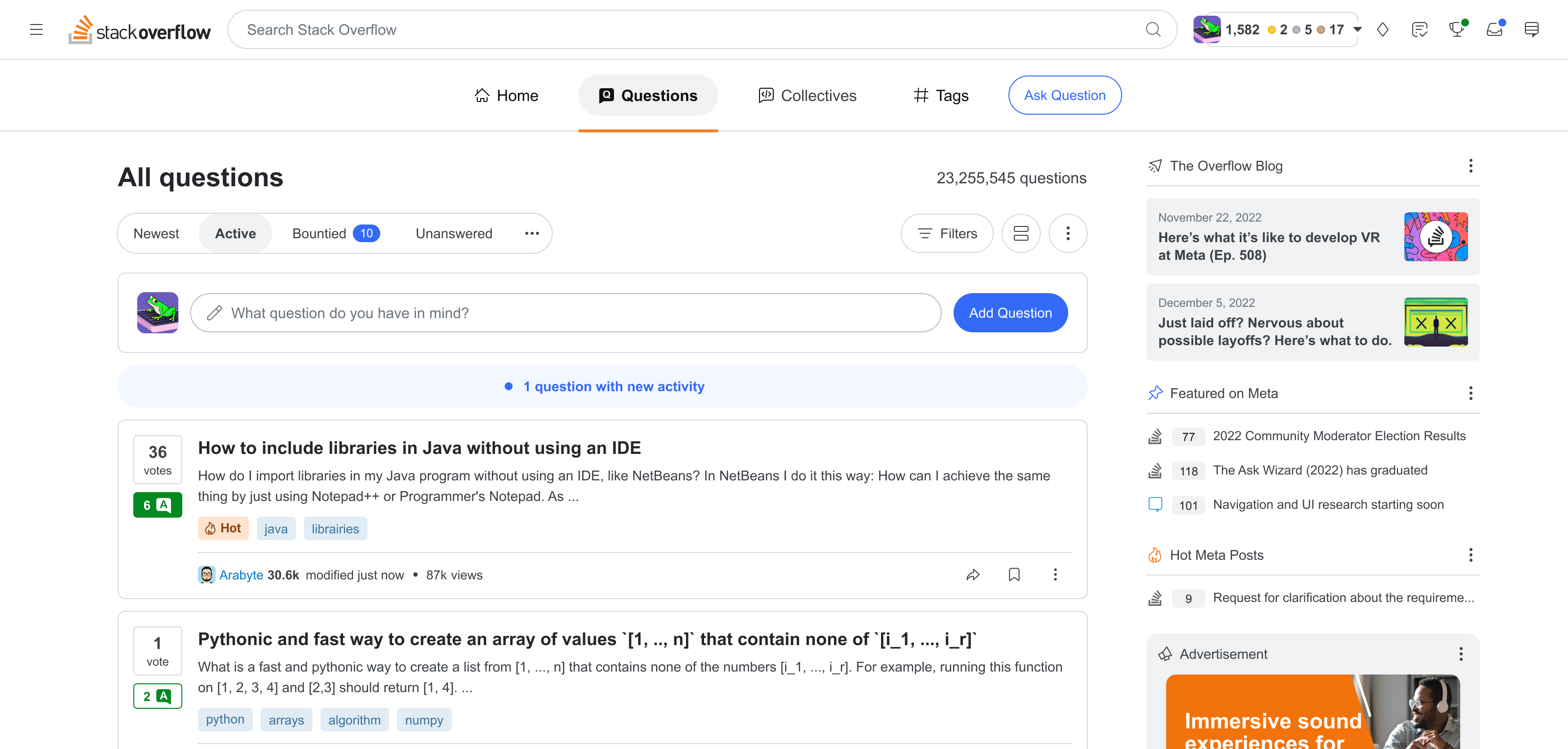
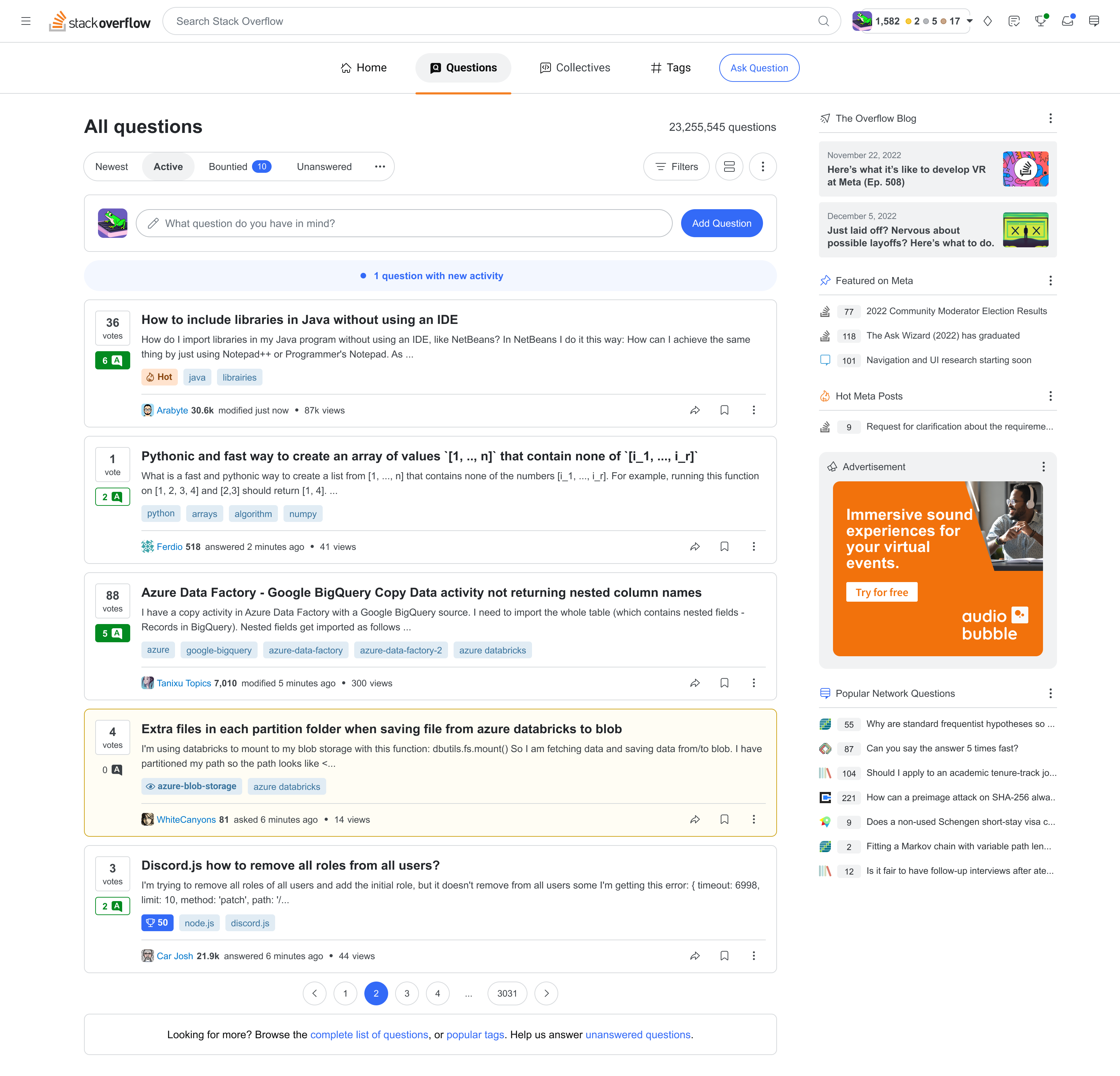
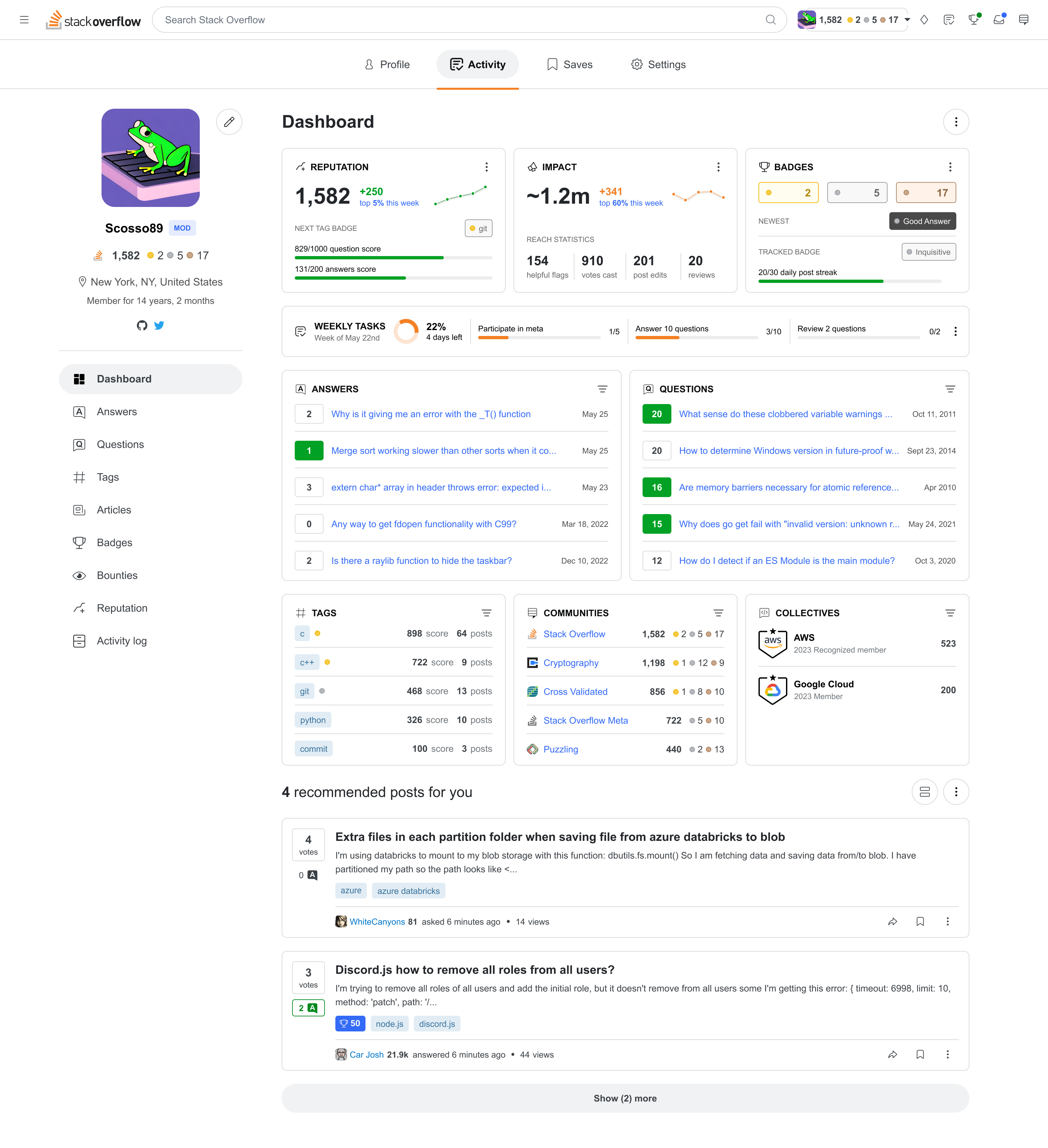
The challenge was to find a way for the redesign to be implemented seamlessly without feeling out of place with the current design. So the plan was to first update the navigation, colours and icons, then implement incremental changes to the core Q&A experience, pages and components.
With this plan in mind, I designed a north star interface to get feedback from users. The new design was based on these 4 principles:
1. Onboarding and accessibility
Make the site more accessible and user-friendly for new users.
2. New information architecture
Redesign the information architecture to improve content discoverability and usage of site features.
3. Better mobile approach
Cater to the needs of users accessing the site on smaller screens.
4. New visual design
Modernize the interface by aligning with design trends and usability standards.
Conclusion
Stack Overflow’s position as a trusted resource for programmers remains strong, but without investing in its user experience and design, other products or alternatives could surface and result in a decreased user adoption, retention, and relevance.
Thankfully, the insights and proposed design direction provided valuable guidance for future updates and features, such as an initiative to redesign search result pages and OverflowAI.
Thank You for Reading
If you would like to know more about my design process for this project, schedule a call with me! There is still so much more to share about this project, and I would be delighted to discuss it further.
